FLORAH FLOWER SHOP APP
Problem: Many users have a very busy schedule that can make it difficult to spend a lot of time searching for a florist or to go to a florist's brick and mortar to pick up their order.
The Goal: The florAH app will let users buy pre-made and customizable bouquets/flower arrangements which will affect busy people by allowing them to order personalized flowers from wherever they are in the world and have them delivered or picked up (locally) at their convenience.
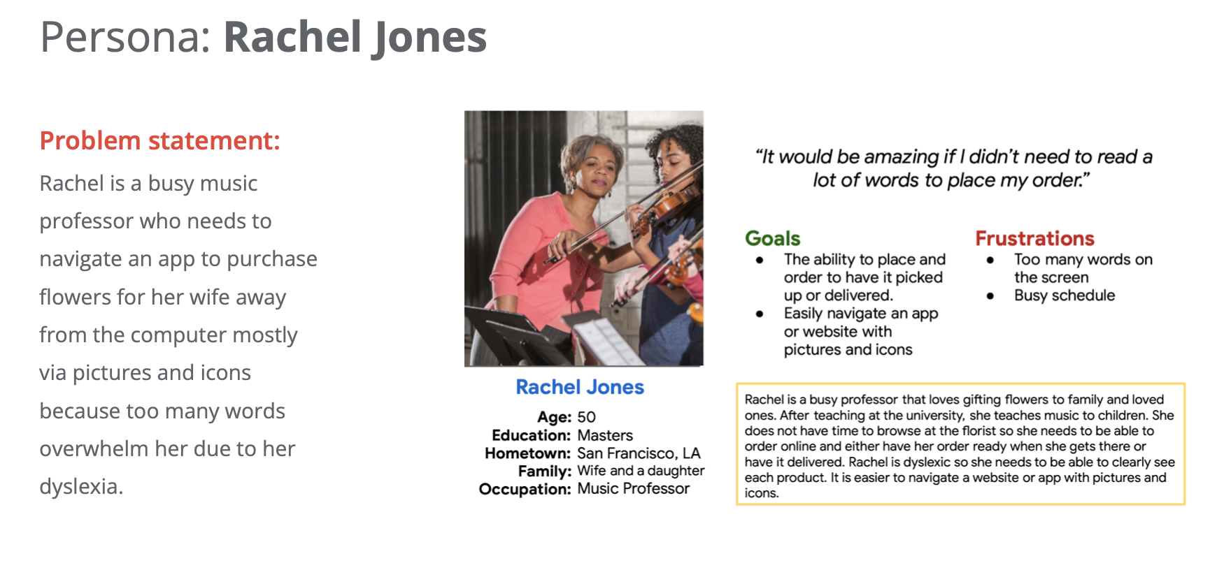
Target Audience: Busy professionals ages 25-70 that live in a metropolitan area.

Dates
September 2022-March 2023
Role
UX Designer + Researcher
Responsibilities
Conducting interviews, paper and digital wireframing, low and high-fidelity prototyping, user research, conducting usability studies, accounting for accessibility, and iterating on designs
PAIN POINTS/CHALLENGES
Users have a busy schedule
Some users are visually or mentally impaired.
Waiting until checkout to find out that a product is out of stock.
Not being able to see past purchases or favorite items.
SOLUTIONS

I will make an app that is intuitive and allows users to complete their order in less than 5 minutes.
I will include a lot of pictures and icons so that users do not have to read a lot of words to know how to navigate the app.
The app will feature products that are almost gone and will feature a product count when inventory reaches under 20 units.
The user will be able to see their past purchases and favorite items.
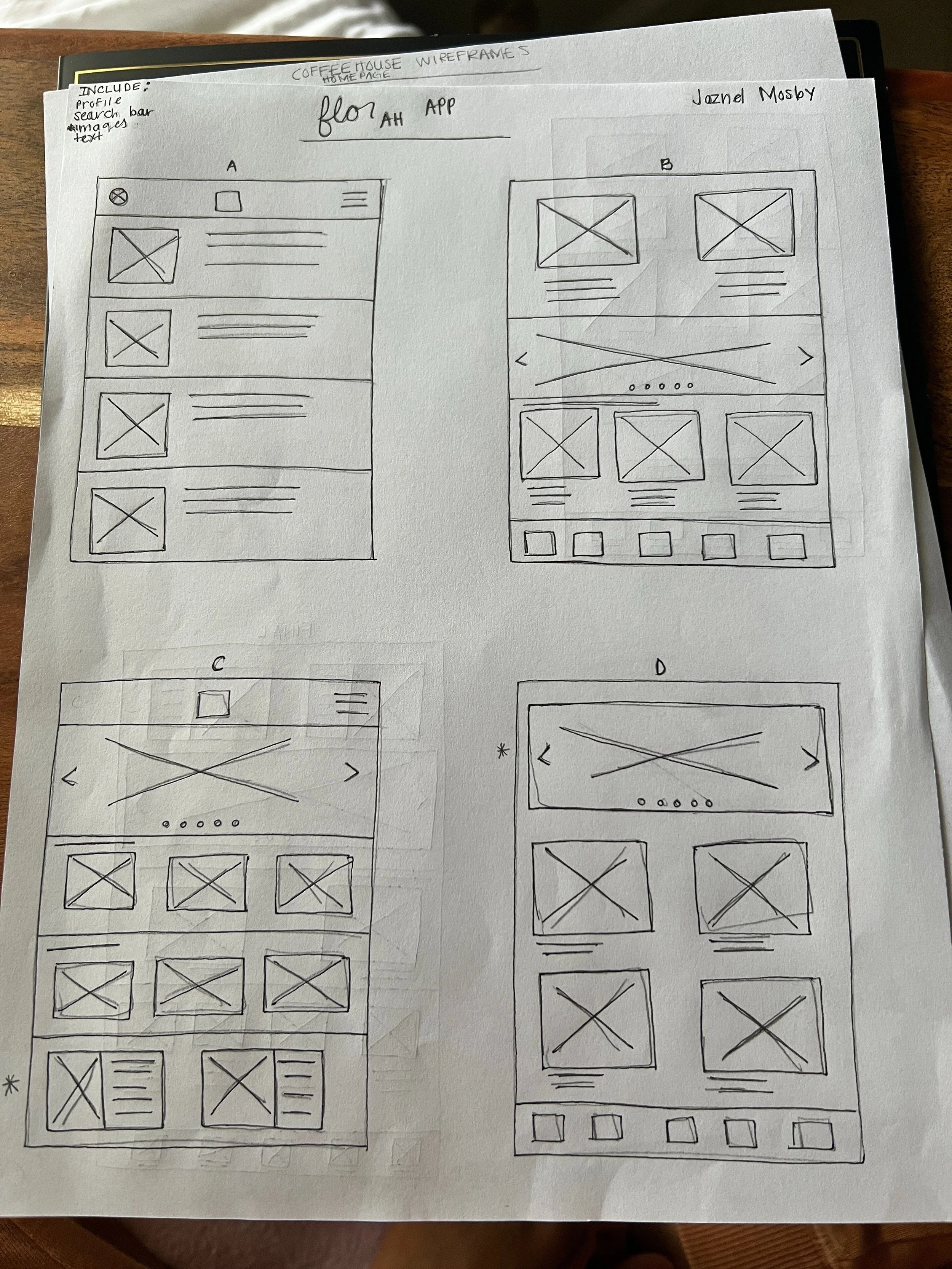
PAPER WIREFRAMES
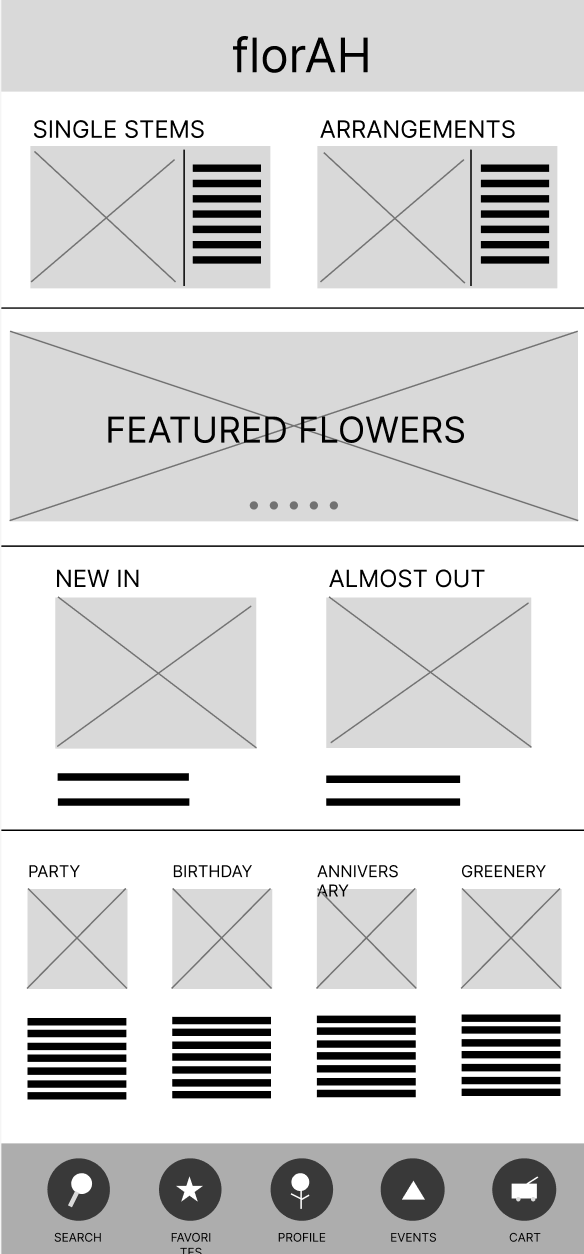
Ideating on what I would put on the home screen was challenging. Ultimately, I chose an option that displayed quite a bit of options to give users an idea of what the company/app had to offer at first glance.

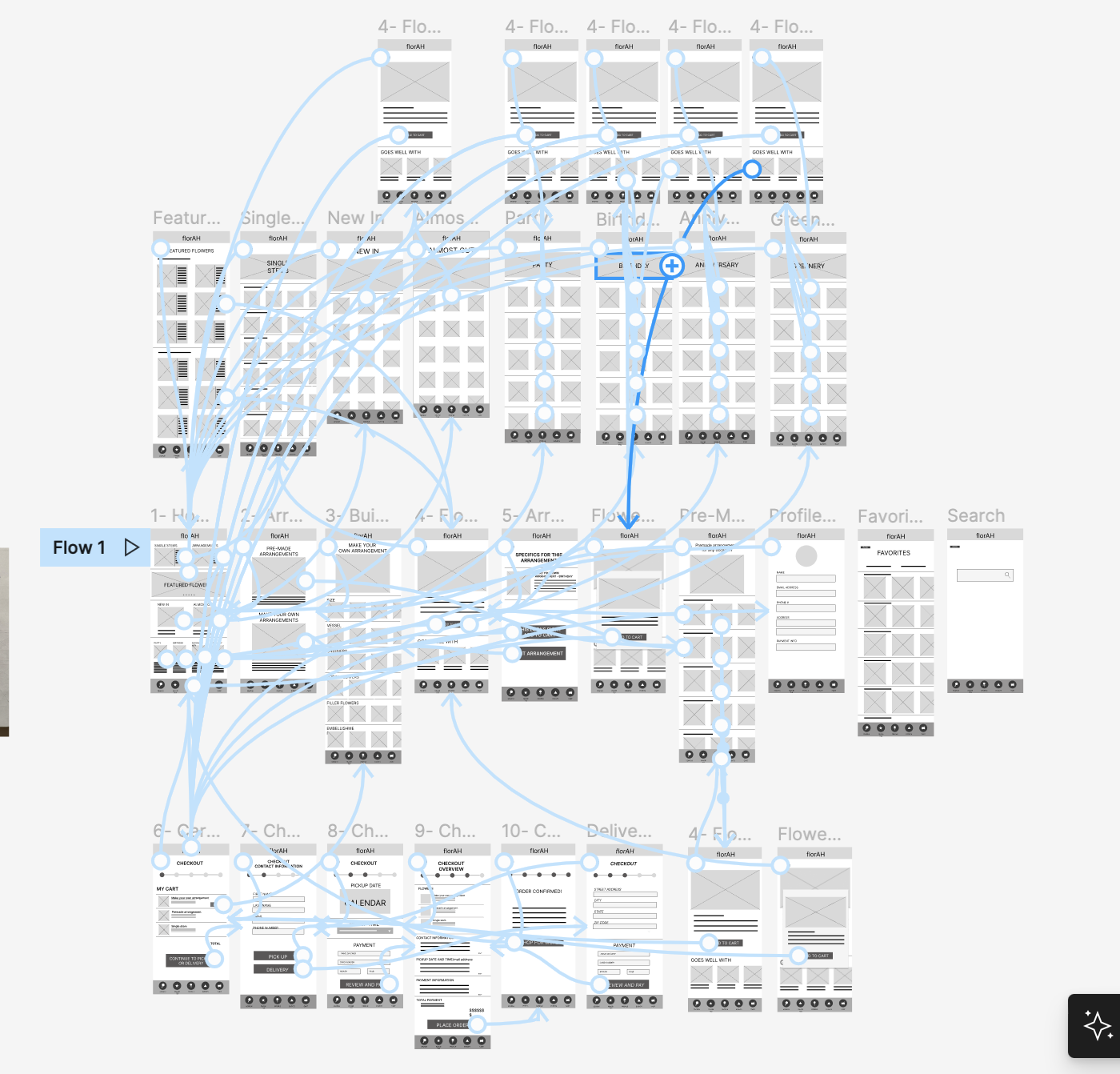
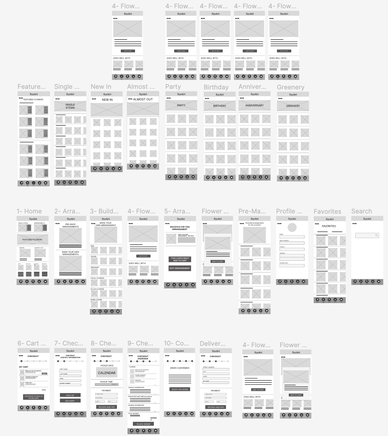
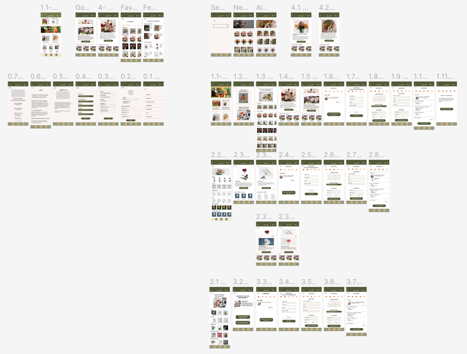
DIGITAL WIREFRAMES
Choosing to design an app for a floral shop proved to be extensive, but once I got in the groove of it, I was completely committed to the process. I created the wireframes in Figma and I feel as though I would have enjoyed creating the designs more in AdobeXD. I researched online floral companies and thought of all of the different options a user would want available to them when ordering in an app.
USABILITY STUDY + FINDINGS
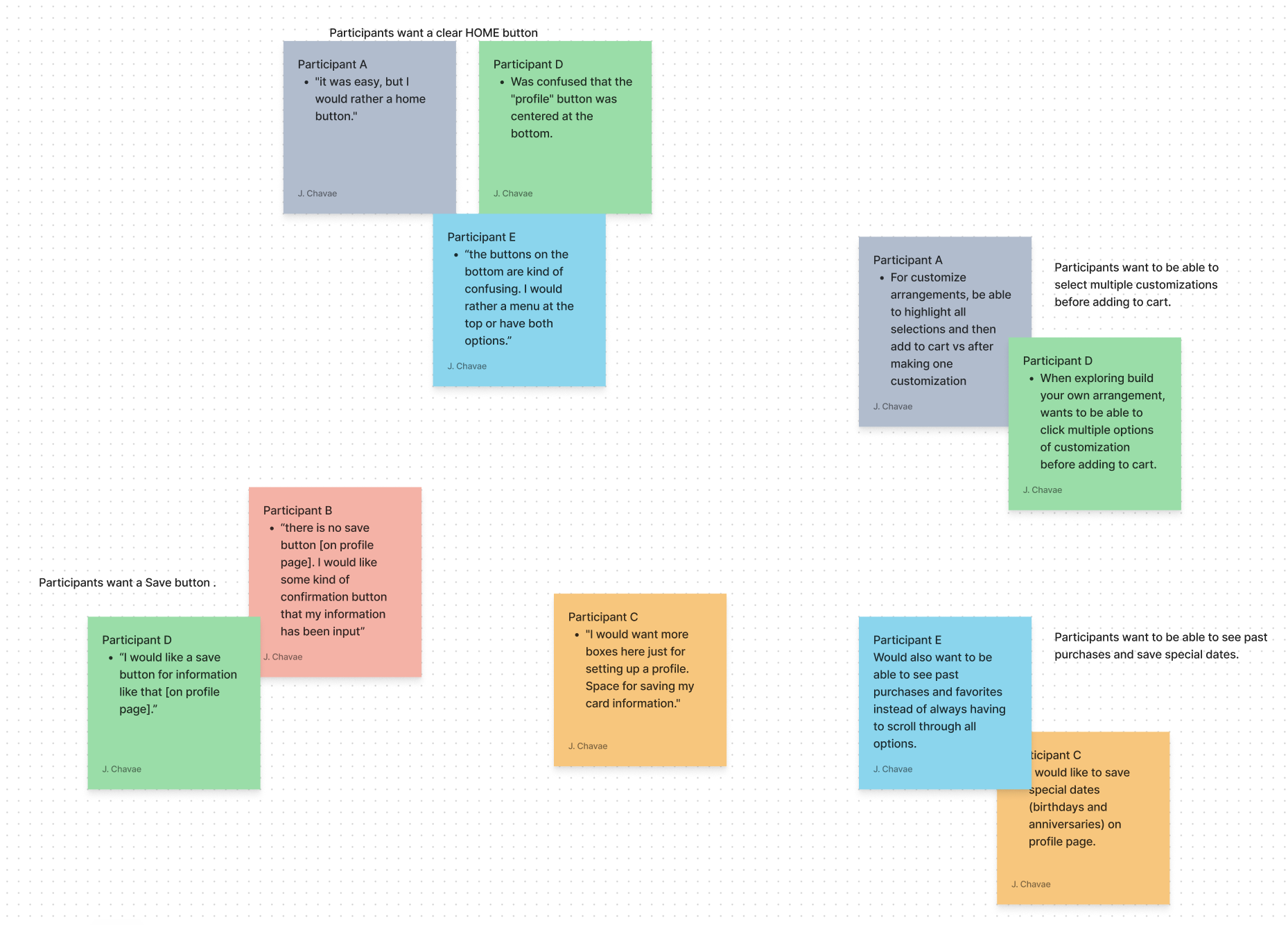
I conducted an unmoderated user study that involved six (5) people. I had assumptions that the design would be intuitive to every user. Although all participants were able to complete the tasks, it was great to learn what would make the experience better for users and for them to flow through the app more intuitively.
Round 1 findings
Profile button being at the bottom was not intuitive for everyone.
I have included a more intuitive way to navigate to the profile page via hamburger/drop down menu.
There was no clear way to go back to home screen.
I have made an adjustment so that when users tap the logo at the top of the screen, it brings them back to the homepage.
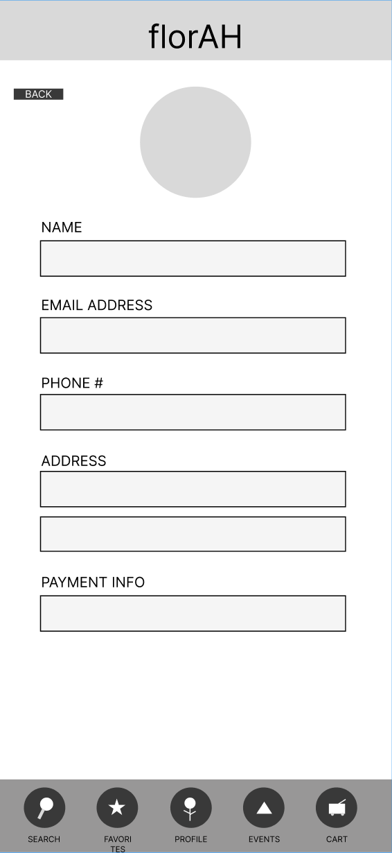
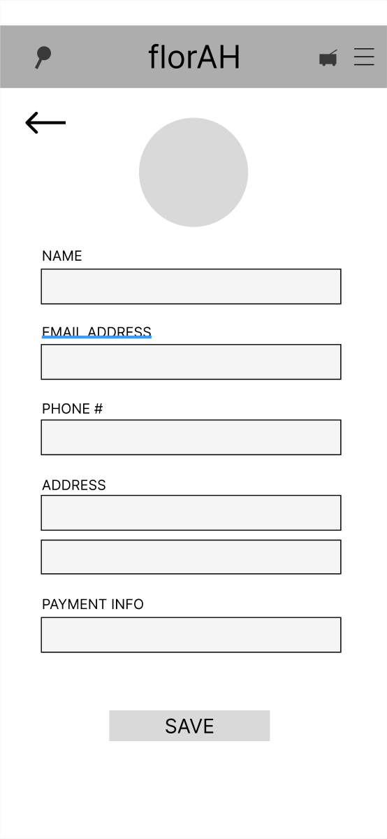
No confirmation of user info being saved.
The app now includes a button that saves user information.
Round 2 findings
The colors originally chosen did not pass WCAG.
I have updated the color palette to be more accessible.
Once a high-fidelity mockup was created, the homepage felt cluttered.
I scaled back on the amount of images on the homepage to create more negative space.
UPDATES
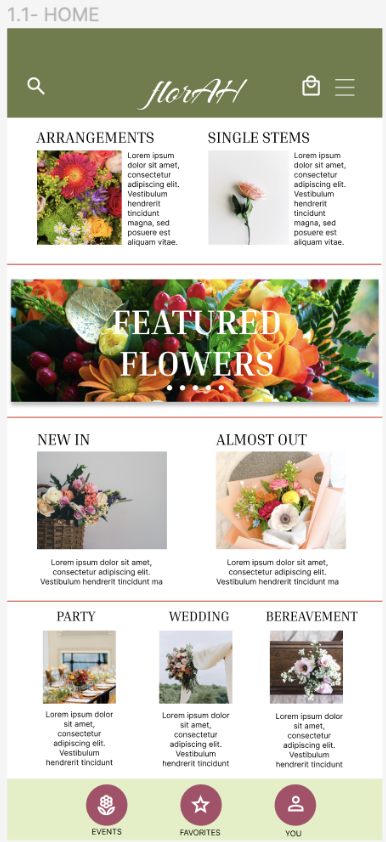
Participant D, "Finding the menu at the bottom was unexpected."
I have:
rearranged and modified the bottom menu
moved the search and cart to the banner at the top of the screen
included a hamburger menu option for a more intuitive path to the profile.
Participant B, "There is no save button. I would like some kind of confirmation button that my information has been input."
I created a save button for the profile page.
I have:
changed the overall color palette to ensure accessibility
changed the shape of the buttons to make it less rigid and match more to the energy of the floral company
I minimized the clutter on the home screen reducing decision fatigue and simplifying the user experience.


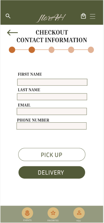
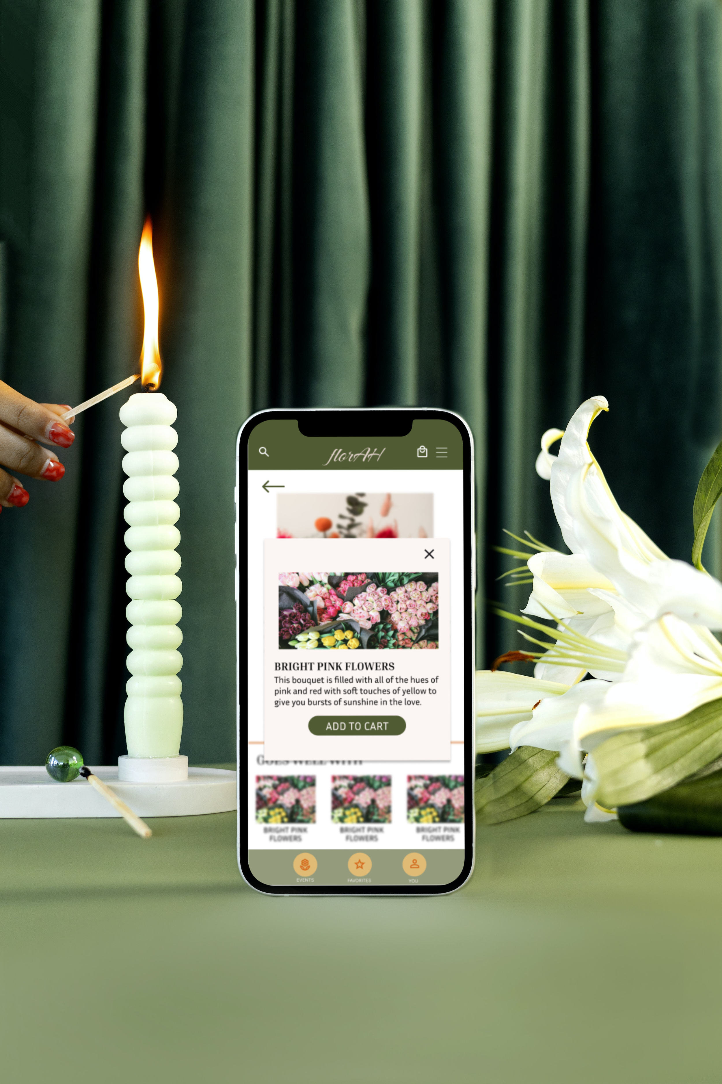
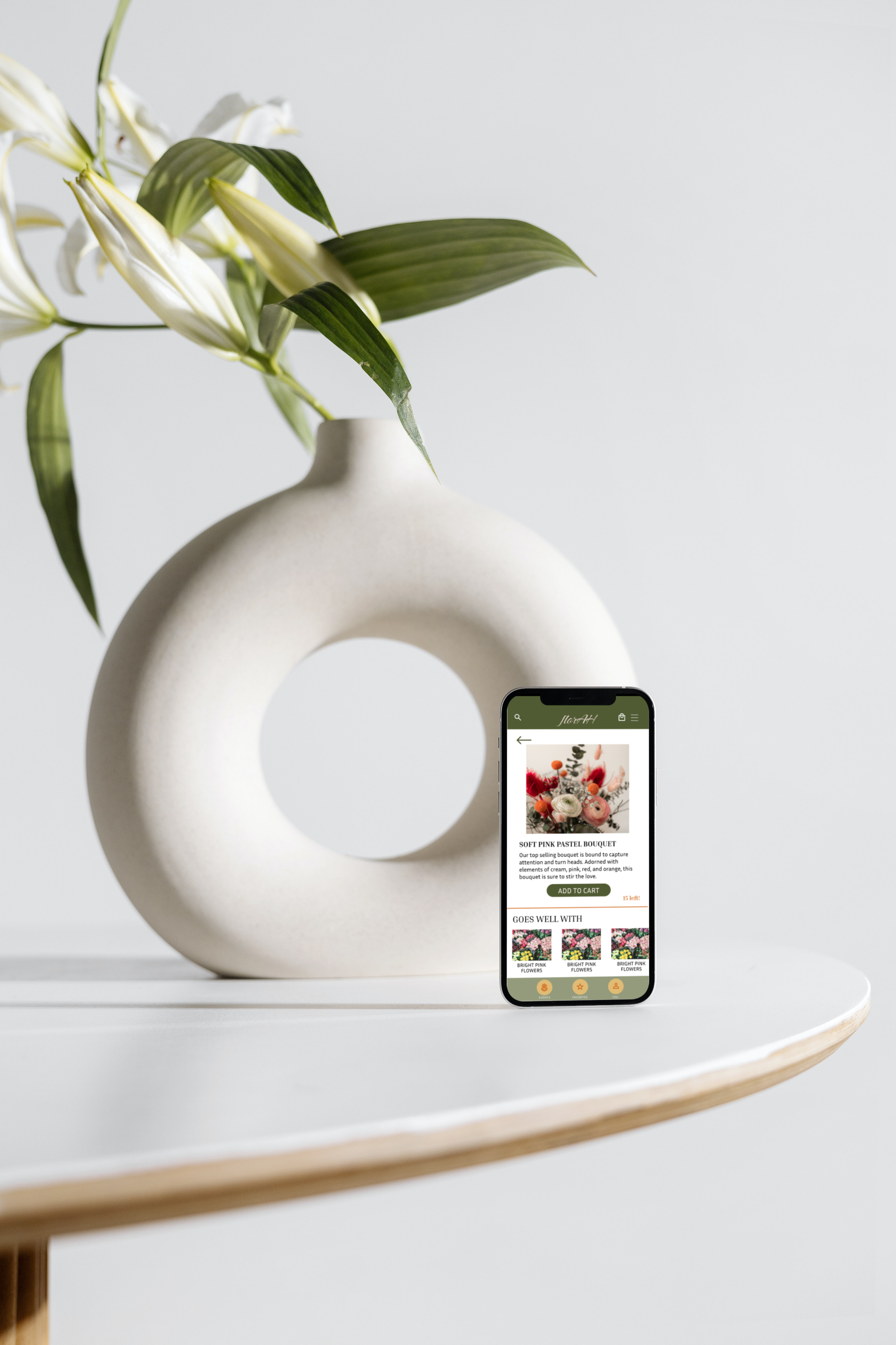
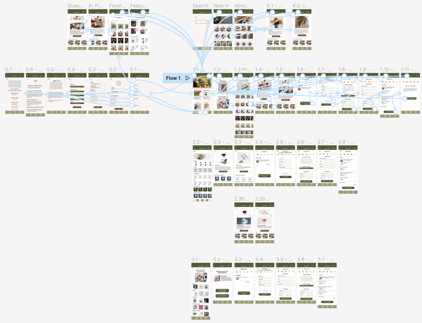
HIGH FIDELITY PROTOTYPES
Click on the image to interact with the prototype.
ACCESSIBILITY
Include an option for users to call in or have a chat bot option. This will help users who may prefer to talk to someone in order to guide them through the purchasing experience.
Ensure colors adhere to WCAG. Color choices should be accessible to ALL users especially when shopping for merchandise online.
Include alt text for images. Since there are a lot of images, include descriptive alt text to ensure that all users can experience the website equitably.
PROJECT OVERVIEW
I learned how much thought and consideration goes into each update as the designer receives feedback that would improve the user experience. Throughout the design process, I realized how many pages I needed to design that I didnt account for in my original ideation. At first this caused a point of frustration because I had to do more work than anticipated, but at the end of the day, it is important to consider the user’s experience and I would not want the users to experience any roadblocks at any point in their user journey or while they are exploring the app. I designed the app based on the original issues to the best of my abilities. What was a boost of confidence was that the user study participants were very excited to see this become a real app even though it was created for the Google UX course.
NEXT STEPS
Continue to work out different design solutions. Continue improving design and the flow of the user journey based on the feedback of the users.
Conduct another usability study with the same participants. Conduct another round of research to see if the improvements resonate with the users.