NESTA’S DREAM
Problem: Many users tend to feel overwhelmed with their choices while shopping online. They dont have much time to spend sifting through hundreds of products.
The Goal: This website will be relatively minimal with pictures as focal points. The users will have minimal options presented to them at once as to not overwhelm them. The goal of the color choices are also to have an earthy feel to ground them throughout their shopping experience.
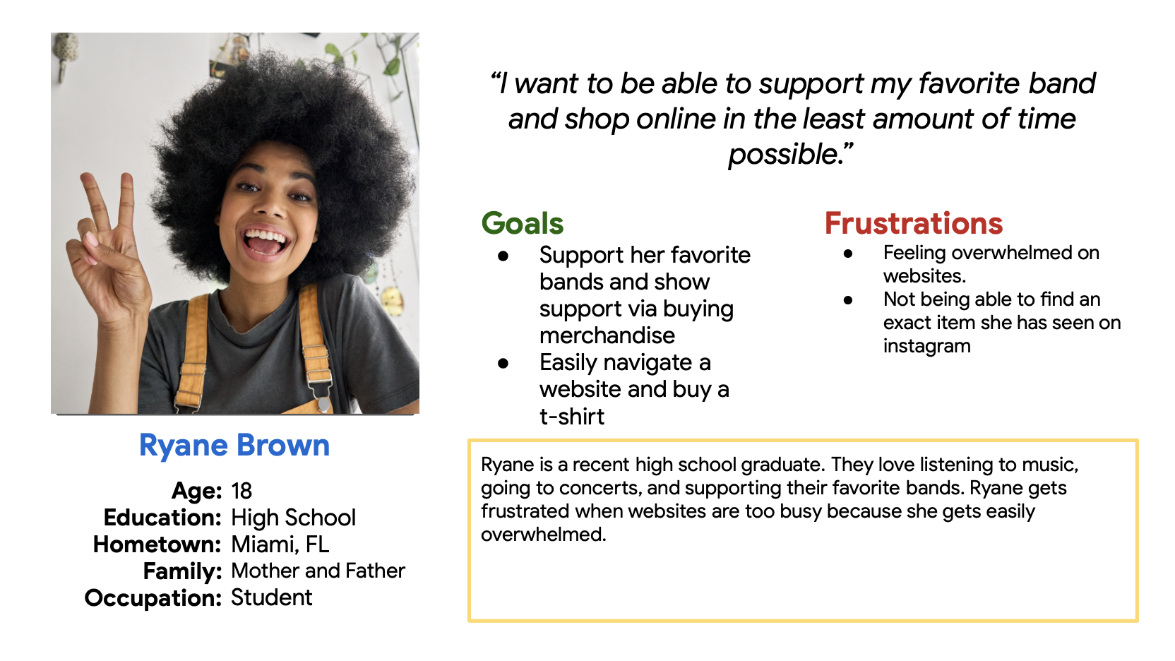
Target Audience: Avid music listeners 18-35 that want to support their favorite bands.

Dates
March 2023-April 2023
Role
UX Designer + Researcher
Responsibilities
Conducting interviews, paper and digital wireframing, low and high-fidelity prototyping, user research, conducting usability studies, accounting for accessibility, and iterating on designs
USER RESEARCH | PAIN POINTS/CHALLENGES
Users can be easily overwhelmed by a plethora of choices.
Some users are visually or mentally impaired making reading a lot of words difficult/frustration
Not wanting to go through the process of finding their favorite items from the beginning
Not being able to see past purchases or favorite items.
SOLUTIONS
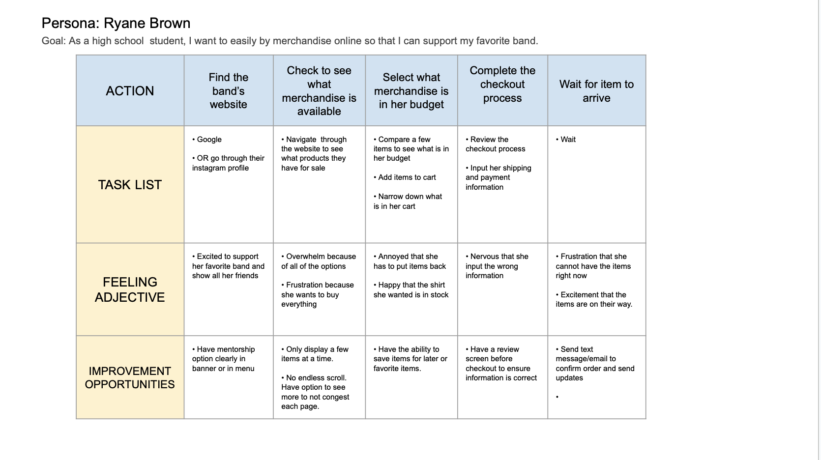
I will create a design that has a lot of negative space and there will be no endless scrolling.
I will include a lot of pictures and icons so that users do not have to read a lot of words to know how to navigate the website.
The website will feature the ability to save for later or favorite items
The user will be able to see their past purchases and favorite items.
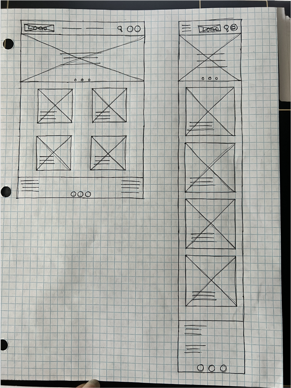
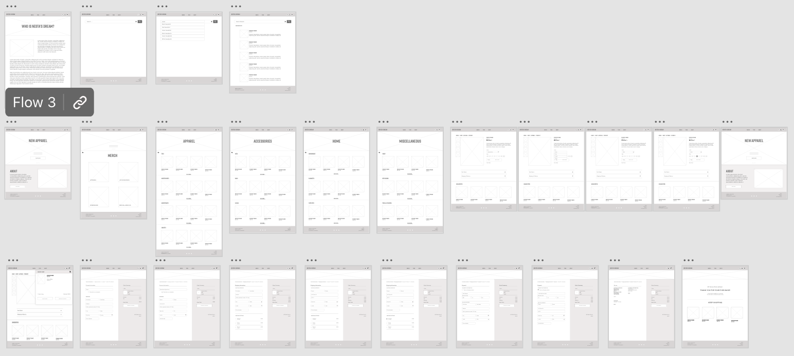
PAPER WIREFRAMES
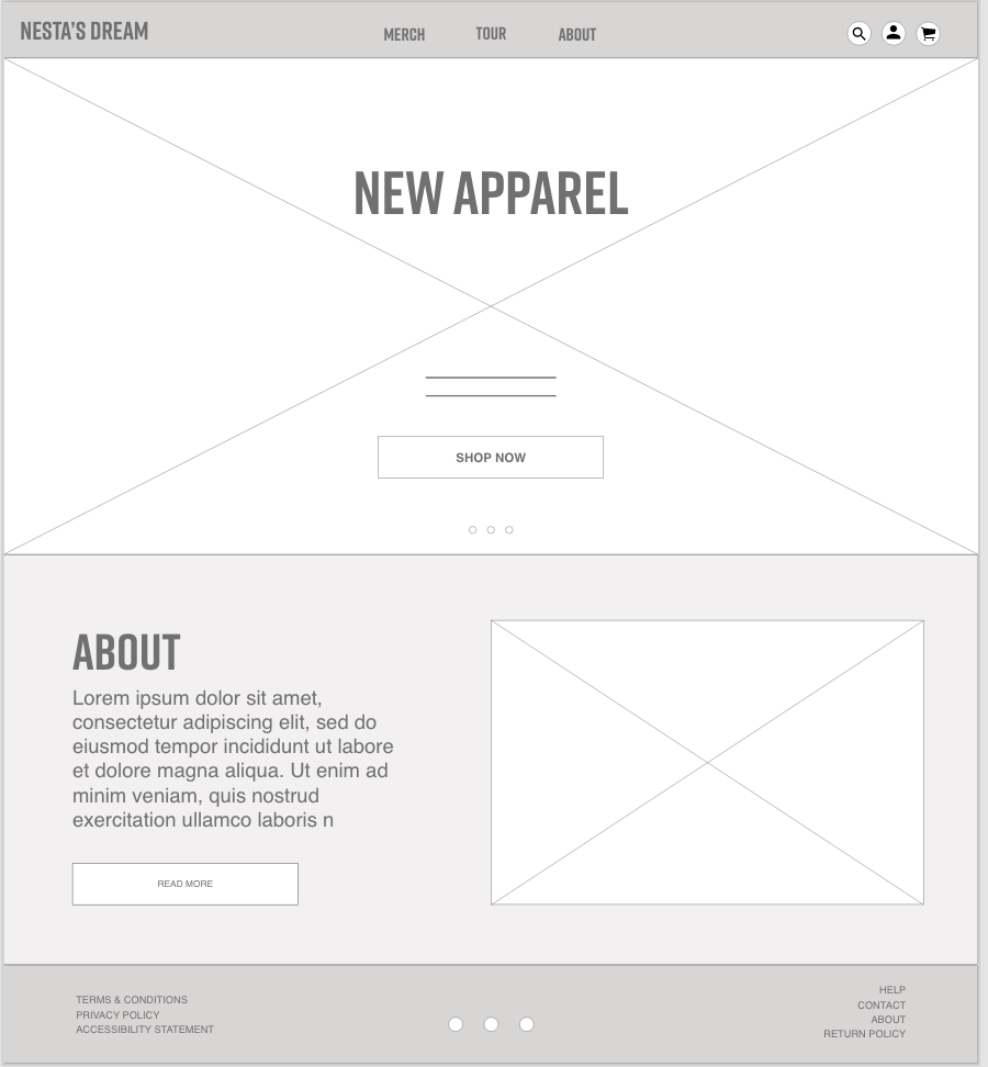
It was fun to come up with different iterations of the home screen. Ultimately, I chose a screen that was visually appealing, but relatively minimal as to not overwhelm the user.
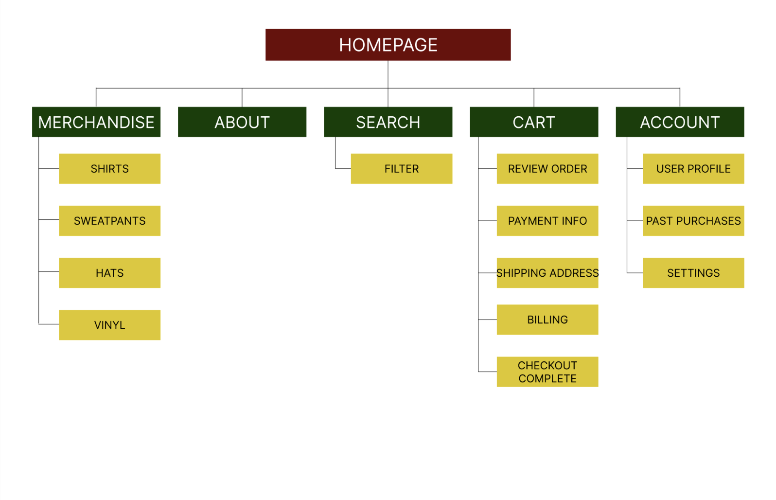
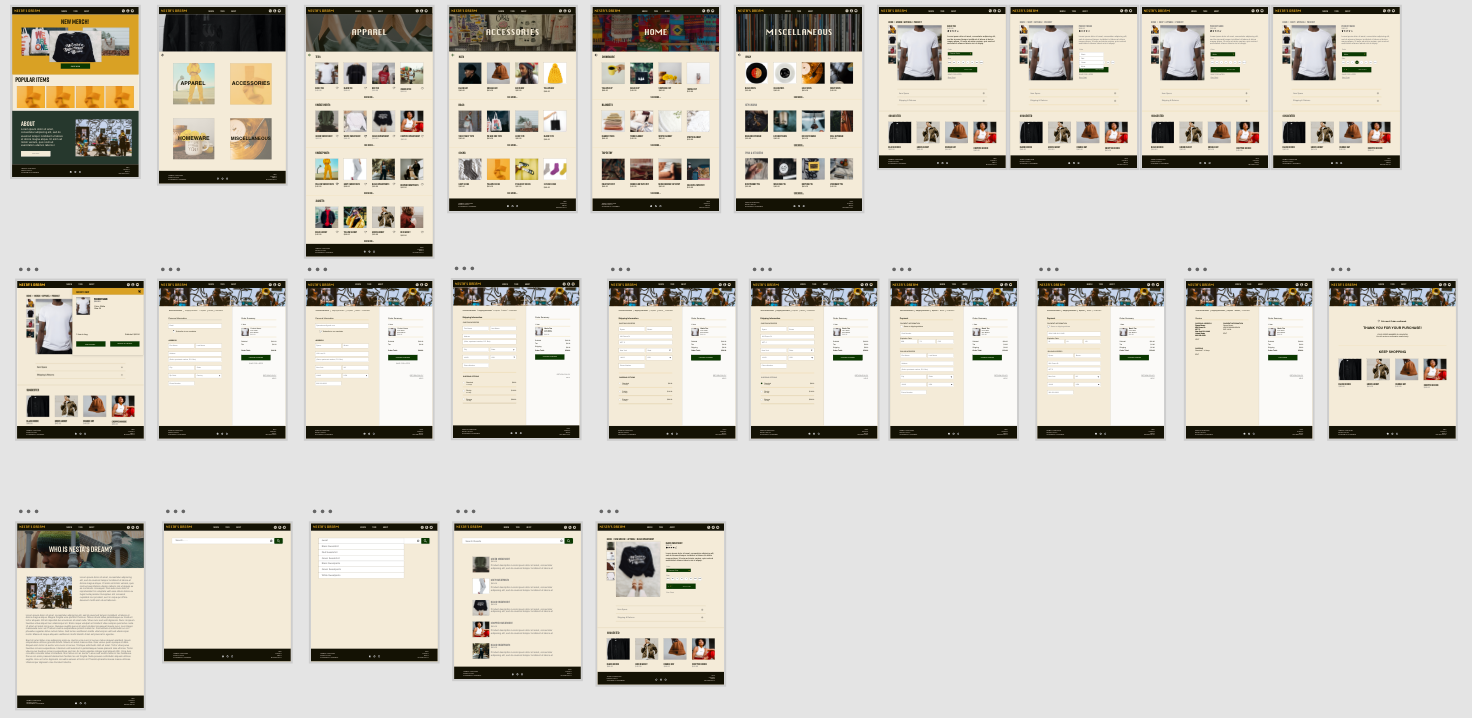
DIGITAL WIREFRAMES
This was my first time using a site map. It was very useful to ensure that I had made wireframes and connections to all of the pages I needed for the user to complete their journey.

USABILITY STUDY + FINDINGS
A usability study was conducted April 2023. It was found that the previous design was mostly intuitive, but needed a bit more refinement that would create more of a flow for users.
A second usability study was conducted May 2023. It was found that a few things could be added to improve the user experience.
Round 1 findings
Users wanted more on the homescreen.
I have added. a section on the homepage below the fold of popular items to add more shopping options.
Users wanted an option to mark and save their favorites.
I added an icon/button to "heart" their favorite items to view later.
Round 2 findings
Users wanted an option to "save for later".
I added a saved for later button.
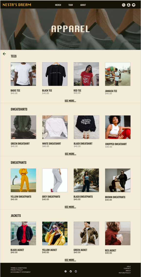
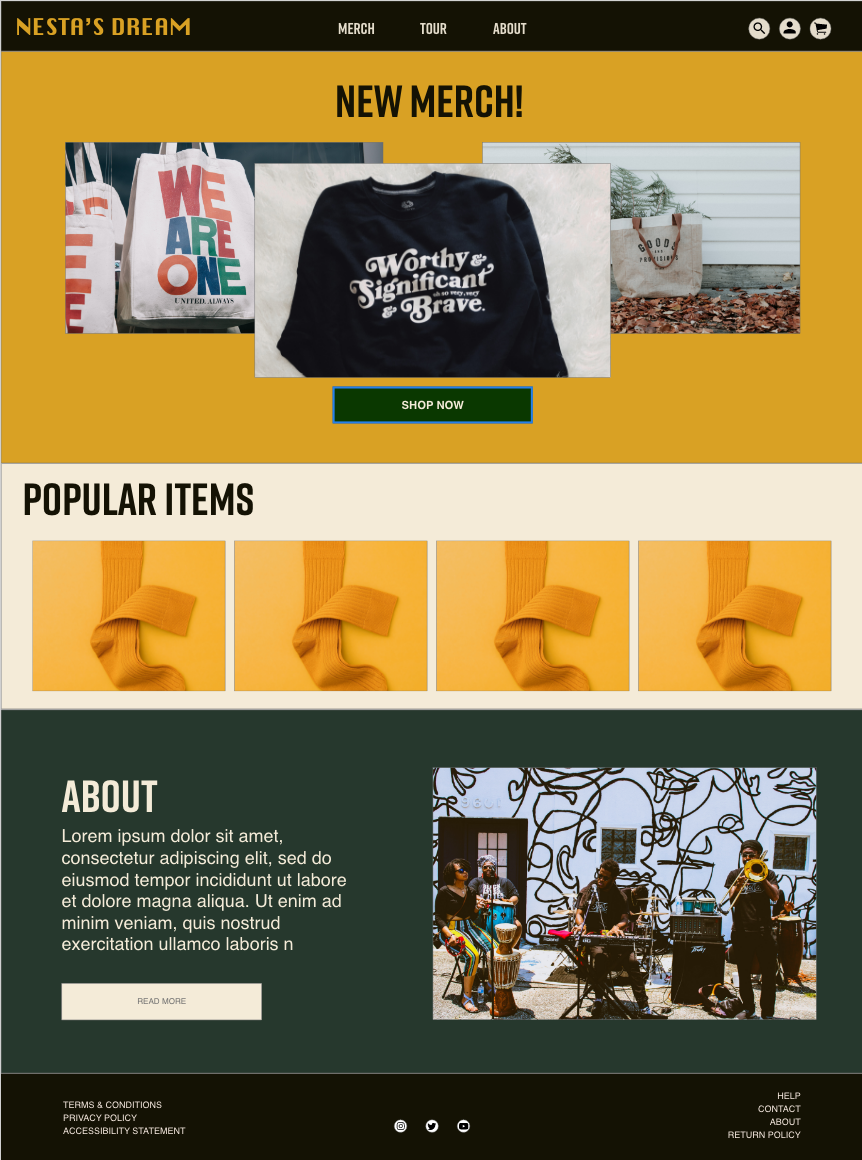
Once a high-fidelity mockup was created, the homepage felt cluttered.
I scaled back on the amount of images on the homepage to create more negative space.
UPDATES
Participant D, "I was expecting a little bit more on the home page."
I added a "popular items" section to increase visibility of more items. I kept it to 4 cards as to ensure that more negative space was on the page.
Participant A, "I would like to be able to favorite items to come back to."
I added the option to favorite each item.

Participant A, "I want to save stuff for later."
I added the option to save for later.

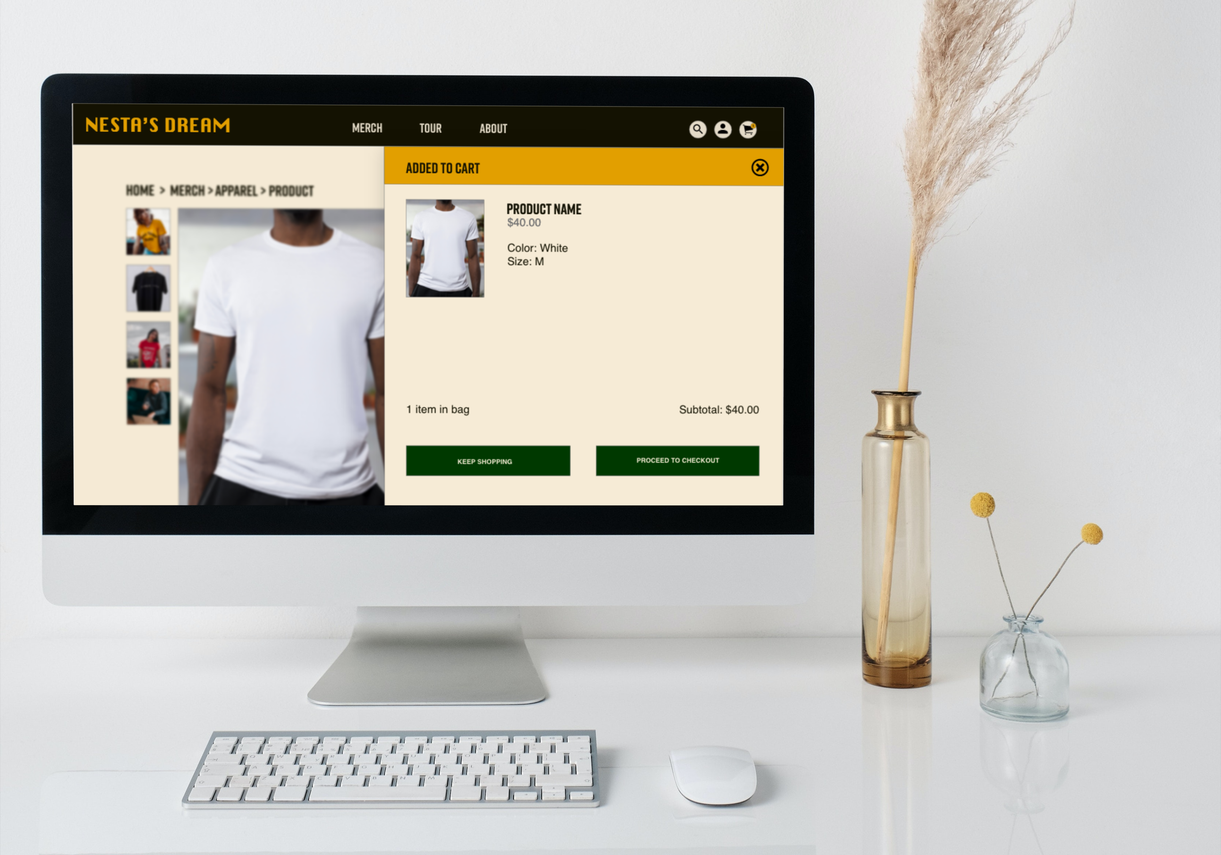
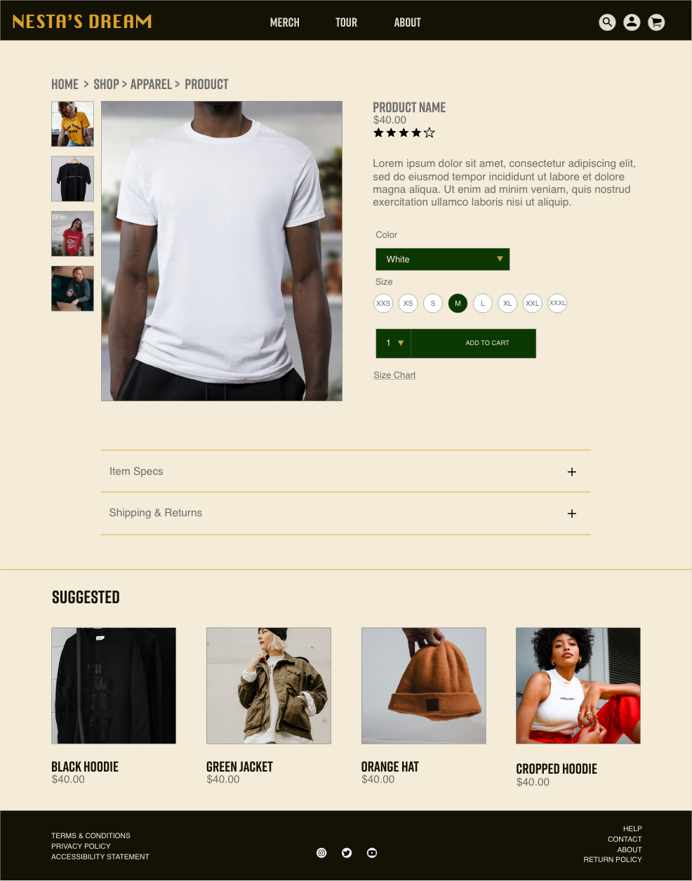
HIGH FIDELITY PROTOTYPES
Please click on the images to interact with the prototype.

ACCESSIBILITY
Ensure colors adhere to WCAG. Color choices should be accessible to ALL users especially when shopping for merchandise online.
Use heading tags. By using header tags, it will make the experience for those with screen readers smoother.
Include alt text for images. Since there are a lot of images, include descriptive alt text to ensure that all users can experience the website equitably.
PROJECT OVERVIEW
Working on this project made me understand the online shopping experience in more depth. This was my first time making wireframes and a prototype for a responsive website. In using the process of graceful degradation, I saw the challenge of making everything that was on a desktop screen fit into a smaller screen. In the future, I may reduce the amount of featured images in order to have more screen space above the fold dedicated to the product, but overall I feel as though the use of featured images allows the users to understand where they are in the matrix of the website.
NEXT STEPS
Continue to work out different design solutions. Continue improving design and the flow of the user journey based on the feedback of the users so that the user can enter the journey from any screen and have a smooth experience.
Conduct another usability study with the same participants. Conduct another round of research to see if the improvements resonate with the users.